An IKEA Kitchen in Capitol Hill (Seattle)
IKEA kitchen with custom doors
A few months ago, we were fortunate enough to have one of our kitchens featured in House Tweaking - an awesome blog, and inspiration for many of our clients, and anyone interested in remodeling. [update Feb. 20, 2026: Sadly, this great blog seems to have gone by the wayside and is no longer available.]
It was definitely a stand out project for us, and I thought it'd be fun to go into a little more detail about the kitchen here, in this post...
This is a hybrid kitchen, utilizing IKEA cabinet frames and hardware, but with our Unhinged custom fronts. We started doing custom fronts for IKEA cabinets about a year and a half ago. I wish I could take credit for the idea, but there were other companies, like Semihandmade, that were doing it long before we started. Still, that doesn't take away from the fact that it's a really great idea! These custom fronts allow for a totally custom look at a fraction of the cost of fully custom cabinets.
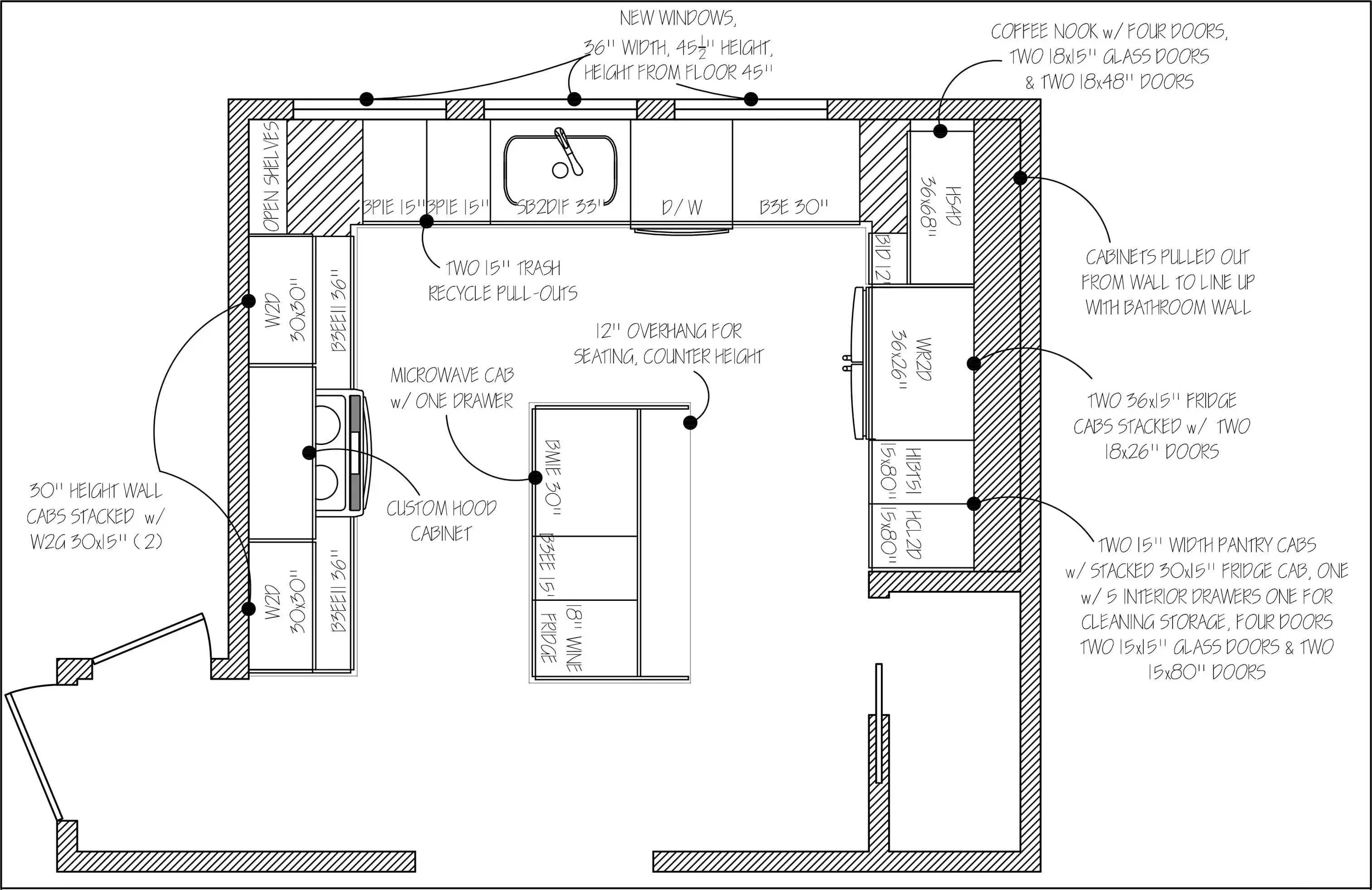
cabinet layout
Our former designer Breanne came up with the awesome design for this kitchen. We were sad to see Breanne leave us last year, due to family and time constraints, but her kitchens live on! Don't worry though, we now have Sarah, an equally awesome and talented designer!
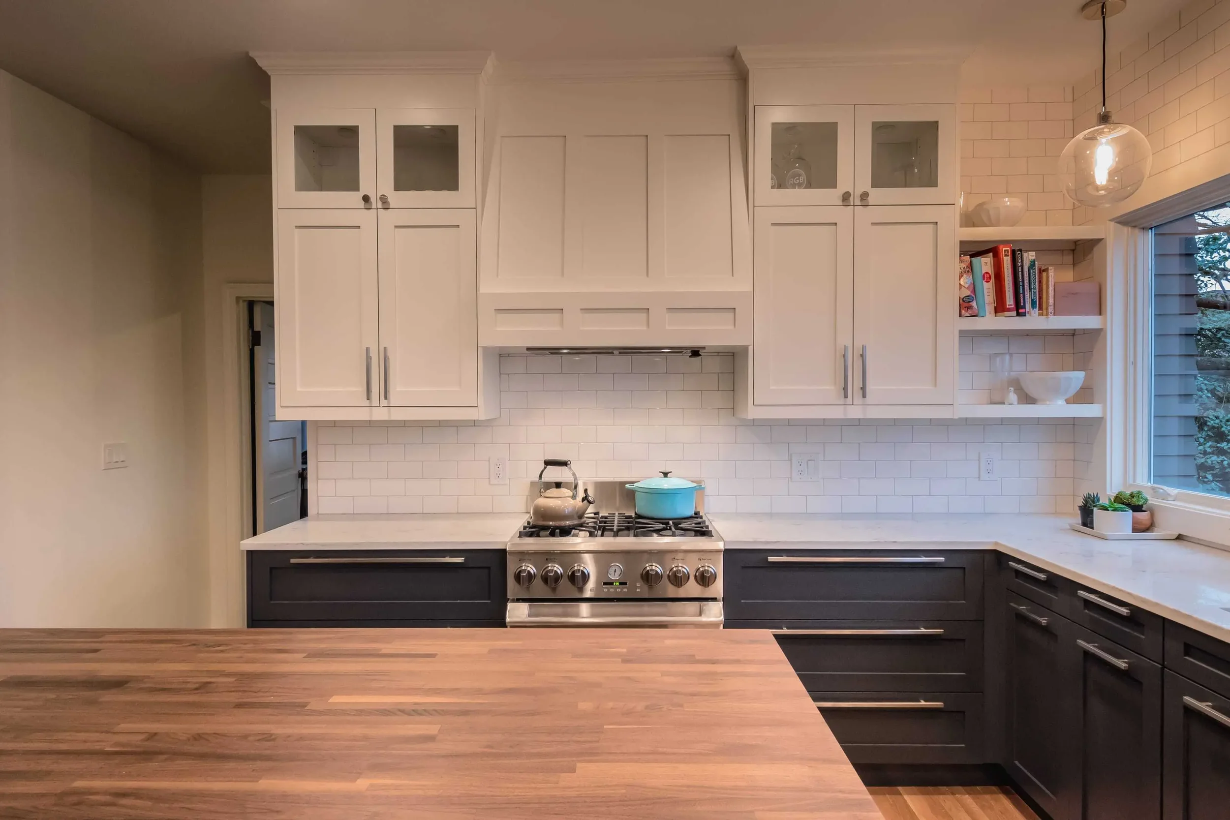
custom, built-in hood
With this hybrid approach, we were able to do things like the custom hood enclosure featured here. Inside, is a built-in hood that the clients purchased from Costco.
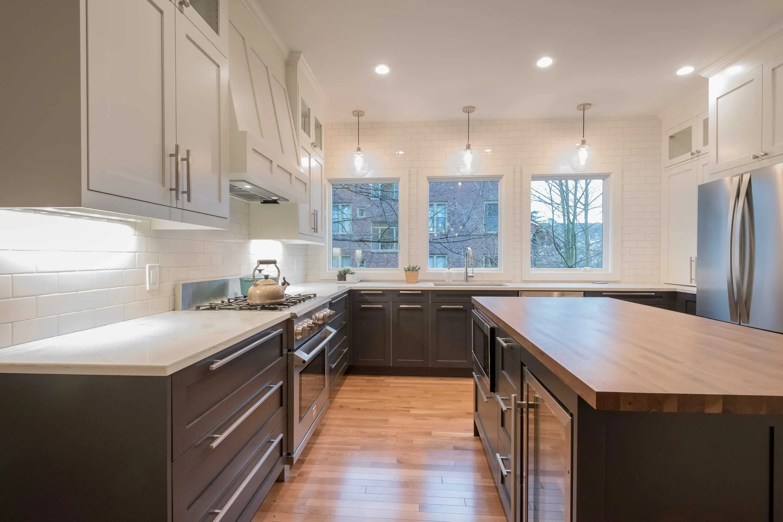
One of the key design elements that makes this kitchen stand out is the use of stacked cabinets. Having 9' ceilings made it possible to stack 15" tall cabinets on top of the 30" wall cabinets for a total of 45". Using glass doors across all of the top cabinets keeps it from feeling too imposing or heavy.
two-toned cabinet design
It seems to me that the key to a great design is a balanced, but varied mix of color and texture, and I think that's where this kitchen shines. With the use of dark base cabinets, and light uppers, engineered quartz counter tops on the perimeter and walnut butcher block for the island, a mix of glass and solid doors, oak flooring, and the generous use of the classic white subway tile, this kitchen has a lot going on. But on a kitchen this size, if everything had been the same color and there wasn't that variation, it would have been overwhelmingly monotonous!
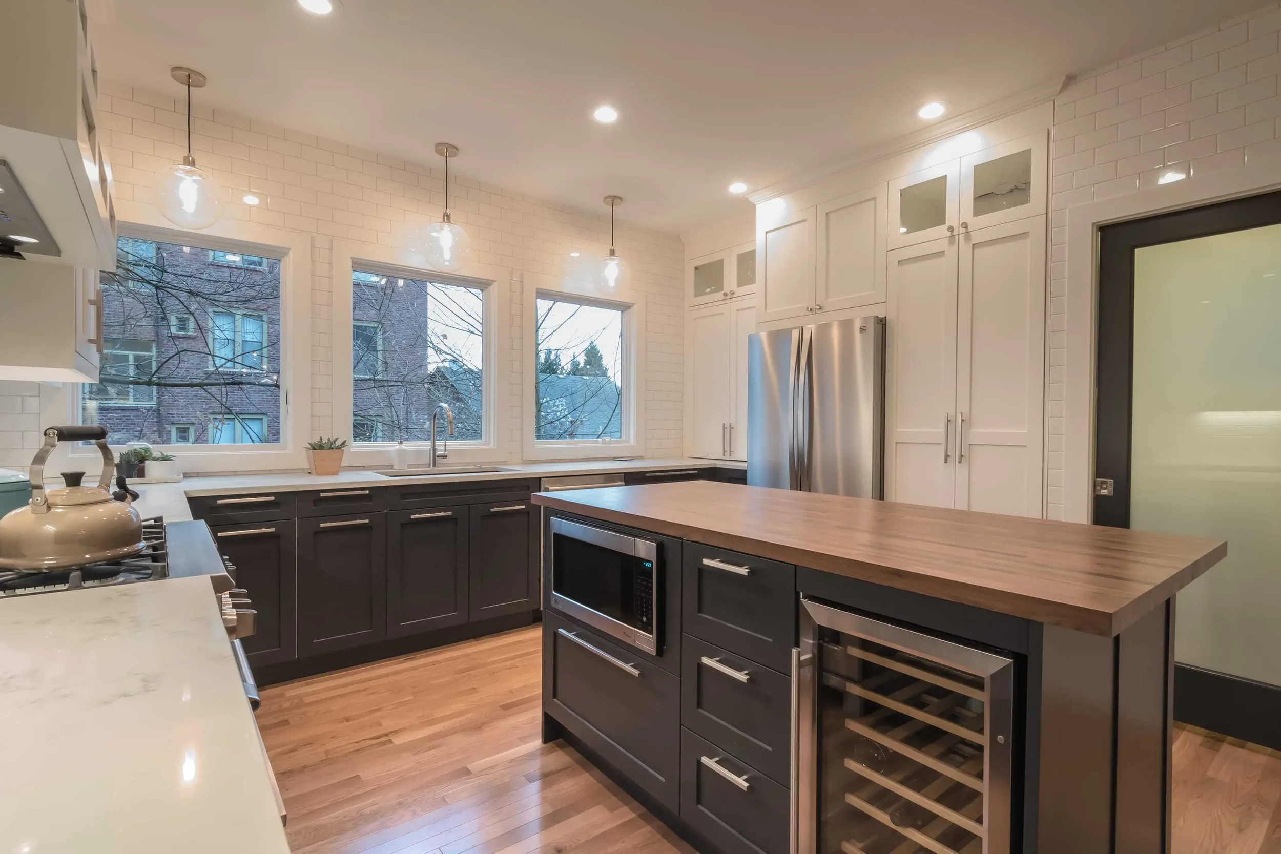
full tile wall with white subway tiles
Speaking of tile - the decision to tile around the frosted glass door pictured above came later, after we'd already tiled the backsplash. I think it was a great call! It's bold nod to the old world roots of this home.
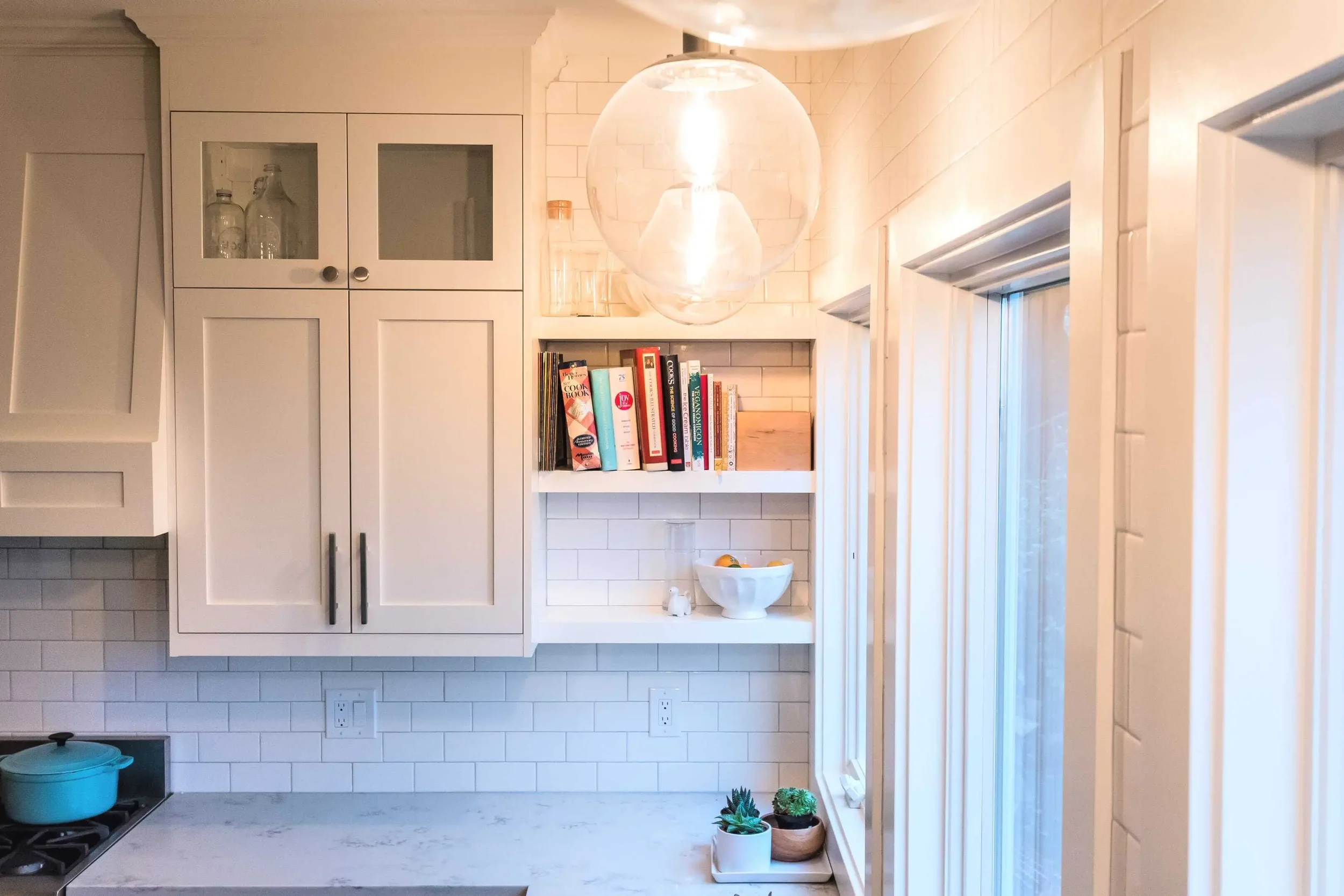
inset open shelving
The corner space wasn't deep enough for another cabinet, because of the window, but it was for the best, because these little open shelves are so perfect here. I'm also loving the globe pendants from West Elm.
Inspired to create your own stunning kitchen in Seattle or the Puget Sound area?

